Showing posts with label children's fiction. Show all posts

Friday, 3 November 2017

Peril for the Guy by John Kennett, a Lewes Bonfire Book Bargain

Guy Fawkes Night, or Bonfire as it's known locally, is a big deal here in Lewes. Each November the 5th (or, as it is this year, the 4th; Bonfire never takes place on a Sunday) thousands line the streets to witness the six bonfire societies – whose memberships number in the many hundreds – and visiting societies from across Sussex parade around the town in a cavalcade of flames and firecrackers, costumes and pageantry, tableaux (the term for the huge, topical – often controversially so – papier-mache effigies the societies build and then blow up) and centuries-old tradition, culminating in the ritual exploding of the Pope and subsequent firework displays at six fire sites dotted around town.

How apposite, then, that in a Lewes charity shop I should come across this:


A first edition of Peril for the Guy by John Kennett, published by Brockhampton Press in 1955, dust jacket and interior illustrations by Stuart Boyle (who also illustrated Evelyn Waugh's The Loved One, and whose daughter Catherine Brighton is herself an illustrator). A children's adventure novel about young Kim Hunter and his four friends – the 'Black Circle' Gang – who set out to collect 'pennies for the guy' but wind up falling foul of the sinister Colonel Hugo Cannon, I suppose its main claim to fame these days is that it became a Children's Film Foundation production the year after publication, directed by James Hill, starring Fraser Hines – later of Doctor Who and Emmerdale – and now available to view in its entirety on the BFI website.


Kennett didn't write that film adaptation, but he did write or edit around fifty other books for children – history and biography as well as fiction – including two sequels to Peril for Guy: Walk into Peril, 1957, and Peril All the Way, 1959. He was also a teacher at Knebworth County Primary School in Hertfordshire, a former pupil of which establishment recalls that mention of the film adaptation of Peril for the Guy was for some reason taboo.


Whatever objections Kennett may have had to the film, they evidently didn't prevent him from signing this copy of the novel on its front free endpaper in the same year the adaptation was released:


How this first of Peril for the Guy – the only signed copy I know of, and an uncommon book in either its 1955 Brockhampton Press edition or its 1973 White Lion reissue – wound up in a Lewes charity shop I couldn't say; the curious religious bookmark that was slipped inside its pages might be a clue, or more likely the inscription on the reverse of the front endpaper:


To a Robert from his Auntie Eve and Uncle Dennis on the occasion of his twelfth birthday. One to ponder over the weekend, perhaps, as Lewes once more bursts into flames.


Linked in this Friday's Forgotten Books roundup. Bonfire photos © Rachel Day. 

Monday, 6 July 2015

Unexpected Places to Find a Bookshop No. 376: a Jazz Festival in East Sussex


Namely the Love Supreme Festival at Glynde Place (about ten minutes' drive from base camp in Lewes), which Edie and Rachel and I attended on Saturday, and which turned out to have a book stall selling a variety of remainder stock. I suppose I shouldn't really have been surprised that there was a bookshop at the festival; it's not the first time I've stumbled upon an unexpected book emporium – it's almost as if I'm psychically drawn to such places – but on this occasion it was even more fitting than usual: we were there as guests of Ethan Iverson, pianist in brilliant jazz trio The Bad Plus – who were playing with saxophonist Joshua Redman as part of their 2015 tour – but also crime and spy fiction enthusiast and noted Donald E. Westlake and Ross Thomas aficionado (among many other authors), which is how I know Ethan.


Rachel and I had seen The Bad Plus before, at Ronnie Scott's over two years ago, but Edie hadn't been born by that point, so Saturday was her first exposure to the band (having met Ethan at the side of the stage prior to the performance, she kept asking where he was while they were playing) and to jazz (not to mention her first experience of a festival). I think it made an impression. Here she is later in the day (having demolished a pizza with gusto) playing saxophone:


And piano:


So a big thank you to Ethan for the kind invite to the Love Supreme; I think he'll be pleased that as a result of attending, not only is Edie well on her way to becoming a jazz head, but that her burgeoning book collection expanded even further too.

Tuesday, 16 June 2015

The Bookshelves of the Two-Year-Old Daughter of a Chronic Book Collector

Speaking of Edie, as I was last week, I thought it might be instructive to see what the bookshelves of the two-year-old daughter of an inveterate book collector look like. A bit like this, in fact:


Those are the shelves in the alcove in Edie's bedroom. Quite a lot of books crammed in there; mostly picture books; mostly, but not exclusively, foraged from the charity shops of Lewes and, occasionally, Brighton. Favourites – both Edie's and mine and Rachel's – among that little lot include Jennifer Uman and Valerio Vidali's Jemmy Button (subtitle The Boy That Darwin Returned Home, Templar, 2013); Heapy & Heap's Very Little Red Riding Hood (David Fickling, 2013); Helen Ward's Wonderful Life (Templar, 2007); and Jason Hook and Ilaria Demonti's Wendy and the Wallpaper Cat (V&A, 2015; more on that one soon). Also firm favourites with Edie are Tony Millionaire's Little and Large (2005) and That Darn Yarn (both Dark Horse, 2005), which are on the top shelf; those actually come from my collection of Millionaire's various Sock Money works, but after reading them to Edie it became evident they really belonged on her shelves, and now she asks for "Sock Monkey" on a regular basis.


At the bottom of the alcove are more books, and yet more in a little bookcase next to it. Favourites among that lot include the Little Miss and Mr. Men box sets (the latter with Anna out of Frozen sitting atop it) and Judith Kerr's Bedtime Tales set, especially The Tiger Who Came to Tea and Mog the Forgetful Cat. And there are other entries in the Mog series scattered throughout Edie's book collection, including here:


A shelving unit downstairs in the lounge which originally housed some of my records but now houses rather fewer of my records and rather more of Edie's books and toys. Still, I only have myself to blame there...

Wednesday, 16 October 2013

From the Lewes Book Fair: Vintage Paperbacks by Michael Dibdin, Isaac Asimov and Patricia Highsmith, Plus Some Children's Books

It's been a while since I've blogged about the Lewes Book Fair and the books I've bought thereat (is "thereat" even a word...?), chiefly because despite attending almost all of the fairs over the past year or so (apart from the one in May, due to little Edie choosing that weekend to make her grand entrance), I didn't buy a single book (this 1958 third impression of the Hart-Davis edition of Ray Bradbury's The Illustrated Man was, I believe, the last thing I got there). However, that dry spell was broken at Saturday's (12 October) event – the final one of the year (there were, I think, only four this year, as opposed to the usual five) – when I came away with three vintage paperbacks for a pound a pop, plus some kids' books; so before we get to those promised Elmore Leonard posts, I thought we could take a look at wot I got.


A 1980 first Sphere paperback edition of Michael Dibdin's debut novel, The Last Sherlock Holmes Story, originally published in hardback in 1978 by Jonathan Cape. I'm not quite sure why I decided to purchase this, given that my interest in Sherlock Holmes extends to Steven Moffat and Mark Gatiss's Sherlock and not much farther, and that I still have umpteen Dibdin first editions – the majority of them Aurelio Zen novels – to read and blog about (the only ones I've covered thus far are the Zen books Ratking and And Then You Die). Maybe it was the Kingsley Amis blurb on the front cover wot did it – that and the fact that the book was only a quid, whereas a first edition would be more like sixty quid (and probably more).


A 1960 first Panther paperback edition of Isaac Asimov's Foundation, originally published in hardback in 1953 by Weidenfeld & Nicolson. I have a habit of occasionally picking up cheap paperback editions of science fiction classics with a view to, at some point, in some mythical future era where I miraculously have hours and hours of leisure time at my disposal (not retirement, before you suggest that; I doubt I'll ever be able to afford to retire), finally getting round to reading them (see also Brian W. Aldiss's Non-Stop). Never gonna happen, obviously, but dammit I can dream, can't I? The cover artist, by the way, is unknown (even to the illustrious Steve Holland) – as is the cover artist of the third and final paperback.


A 1968 first Macfadden paperback edition of Patricia Highsmith's Those Who Walk Away, originally published in hardback in the States in 1967 by Doubleday. This is my prize score from this bunch; unlike the other two paperbacks, which were published by British outfits, this one was was published by an American imprint, which, in conjunction with the fact that it's pretty scarce – there are at present just four copies on AbeBooks, all offered by US sellers – makes it quite unusual in the context of it being found at a provincial British book fair. I actually already own the novel in its 1967 UK Heinemann edition – see the recently established Existential Ennui Patricia Highsmith First Edition Book Cover Gallery – but such is my passion for Highsmith I couldn't resist nabbing this too, especially for a pound.

Those, then, were the books I bought for myself at the Lewes Book Fair. But I also bought three books for Edie, who made a special guest appearance at the fair (to the accompaniment of much cooing and the odd comment about starting her reading rather young). In fact Edie did better than I did on the day, because Rachel subsequently picked out a couple more books for her from the Red Cross charity shop (newly reopened as a children's outlet) at the top of Station Street, so that Edie's haul in the end looked like this:


Left to right we have Jemmy Button by Jennifer Uman and Valerio Vidali; Red Ted and the Lost Things by Michael Rosen and Joel Stewart; Marigold Garden by Kate Greenaway; The Eleventh Hour by Graeme Base; and Noddy Meets Father Christmas by Enid Blyton. (That last one we're of course keeping in reserve for Christmas.) Phew. As Bruce Forsyth was once wont to say: didn't she do well?

Thursday, 2 May 2013

Dr Who in an Exciting Adventure with the Daleks (alias Doctor Who and the Daleks) by David Whitaker (Armada, 1965/Target, 1973)

NB: Linked in this week's Friday's Forgotten Books, 3/5/13.

A couple of years ago I posted a rambling essay on the Doctor Who Target novelisations – my memories of them, how they helped drive and shape my formative reading as a child, how they were my first and in some cases only exposure to many Doctor Who stories, and how chancing upon a stack of them in a Lewes secondhand bookshop led in a roundabout fashion to Existential Ennui becoming a (prolix) books blog. Shortly after that the BBC began reissuing some of the earliest Target paperbacks, with new introductions by, among others, Russell T. Davies, Charlie Higson and Target Who stalwart Terrance Dicks. Perhaps the biggest draw, though, was Neil Gaiman's intro for the new edition of this:


The very first Doctor Who novelisation, Doctor Who and the Daleks, by Who screenwriter David Whitaker. The copy seen here is the original Target edition, published in 1973, which I came across the other week in a Brighton junk shop; it's essentially the same as the 2011 BBC edition, with the same Chris Achilleos cover, although obviously minus the Neil Gaiman intro. But as Neil notes in that later intro, the Target paperback wasn't the first edition of the book; it was originally published in 1964 in hardback by Frederick Muller under the title Dr Who in an Exciting Adventure with the Daleks, and then again under the same title in 1965 in paperback by Armada, which was the edition that Neil read it in ("old and battered now, from so much reading"). The Muller hardback goes for hundreds of pounds these days, but the Armada paperback can be found for a few quid online if you look hard enough. Which, suitably intrigued having bought the Target edition, I did:


Whereupon I discovered that there are a number of differences between the Armada and Target paperbacks. Self-evidently the covers are different – the Armada edition cover art is by Peter Archer, an artist best known for his Hardy Boys and Malcolm Saville work – but the interiors differ too. The text remains the same in both, but while the interior illustrations in the Armada edition are again by cover artist Archer:


in the Target edition they're not the work of Chris Achilleos but rather one Arnold Schwartzman:


who I wonder if he might be this Arnold Schwartzman, OBE. Answers in the comments, please. (Incidentally, interior illos in the Doctor Who novelisations were restricted only to the initial Muller editions and the first wave of Target editions; thereafter they were dispensed with.)

Dr Who in an Exciting Adventure with the Daleks (or Doctor Who and the Daleks if you prefer) is a novelisation of the second Who adventure, The Daleks (1963/4; it also shares its story with the first Doctor Who movie, Doctor Who and the Daleks, 1965, starring Peter Cushing... keep up at the back), but it's actually presented as if it's the first. Whitaker's innovation was to concoct a whole new opening sequence for the novel detailing the first meeting between schoolteachers Ian Chesterton and Barbara Wright and the mysterious Doctor and his granddaughter, Susan. This originally took place in the debut Doctor Who episode, An Unearthly Child (1963), but Whitaker penned an alternate, eerie, evocative, notably gruesome opening in which Chesterton stumbles upon a road accident on a foggy night on Barnes Common involving Barbara, Susan and an unfortunate lorry driver, "hurled sideways at the moment of impact, the glass of the window shattering but holding him from being thrown out onto the roadway". "Is he all right?" asks a bloodied Barbara, to which Ian replies bluntly, "He's dead."

However, the chief novelty of Whitaker's novelisation is that it's written – quite well, as it happens – in the first person. The standard style for all of the ensuing Who novelisations was third person, but this one is narrated by Ian Chesterton, who makes for an agreeably sceptical companion – both for the reader and for the Doctor. Indeed, much as I love many of the later third-person Who novels – Terrance Dicks' in particular (a few more of which I also found in that Brighton junk shop, to be unveiled in a future post) – first person suits the format rather well, affording an intimate perspective on William Hartnell's devious, irascible Doctor.

It's a cut above what one might normally expect of a novelisation, and a nice acquisition – or rather, pair of acquisitions – in this, the year of the 50th anniversary of Doctor Who. And hey: maybe one day I'll pass on one or the other of the books – and maybe some of the other Who paperbacks I've accumulated – to a small child, and perhaps engender the same enthusiasm for reading the Who books instilled in me as a kid.

Friday, 1 June 2012

Xenophon's Adventure by Geoffrey Household (The Bodley Head, 1961, Bernard Blatch Cover and Illustrations) and Two P. M. Hubbard Children's Novels Join Beautiful British Book Jacket Design

Just for a change, today's additions to Beautiful British Book Jacket Design of the 1950s and 1960s are all children's books. They aren't, however, by authors who are generally recognised as writers of children's fiction; the bulk of both writers' backlists are comprised of, respectively, spy thrillers and suspense novels. Their names will, however, be familiar to regular readers of Existential Ennui, as I've written about them extensively; and the designer of the jacket of this first book – and illustrator of the interiors, too – is an artist who's already appeared in Beautiful British Book Jacket Design...


Published by The Bodley Head in the UK in 1961 as part of the publisher's series of retellings of heroic tales, Xenophon's Adventure is one of only a handful of children's titles Rogue Male author Geoffrey Household wrote during his fifty-year career. It was originally published by Random House in the US in 1955 under the title The Exploits of Xenophon (Household based the book on a story from the seven-volume Anabasis), with illustrations by Leonard Everett Fisher, but for their edition, Bodley secured the services of Bernard Blatch, who designed the dustjacket and provided interior illos; Blatch also designed the jacket of the 1961 Heinemann edition of Frederick Karl's The Quest, a copy of which I found in a Lewes charity shop a few weeks ago and promptly added to the Beautiful British Book Jackets gallery.


I bought this first edition of Xenophon's Adventure in Camilla's in Eastbourne – where, on a previous visit, Rachel picked up her 1965 Collins first of Agatha Christie's At Bertram's Hotel – for £6.50, which, considering non-ex-library copies are listed on AbeBooks for anything from £20 to £100, was a very reasonable price indeed.


The other two children's books I've added to Beautiful British Book Jacket DesignAnna Highbury (Cassell, 1963) and Rat Trap Island (Cassell, 1964) – are both by suspense novelist P. M. Hubbard, and are the only children's novels he wrote. If you follow the links you'll find my original posts on the books and the cover designers, but I've rephotographed the two wrappers from their original appearances; the Anna Highbury jacket was illustrated by Graham Byfield, while the Rat Trap Island one was illustrated by John Strickland Goodall.


And I'm still not quite done with the Beautiful British Book Jacket Design of the 1950s and 1960s, because next I'll be reviewing three novels by one of my favourite authors, Patricia Highsmith, all of which, in their Heinemann first editions, boast terrific dust jackets, two of which are little-seen online, and third of which, I believe, has never been seen on the web...

Wednesday, 28 March 2012

Anatomy of a Cover: I Would Rather Stay Poor by James Hadley Chase (Robert Hale, 1962); Val Biro Jacket Art and Roughs

As teased in yesterday's final Geoffrey Household post, today's post concerns the artist responsible for the dustjacket on that 1952 Michael Joseph edition of A Time to Kill – one Val Biro. I've mentioned Biro's work once or twice before, but recently I've been paying more attention to the books his artwork graces the jackets of, especially those which fall within the broad remit of Existential Ennui – crime fiction, spy fiction and so forth. Reason being, I had the great pleasure of meeting Mr. Biro just the other week, and consequently acquired two pieces of ephemera related to this book:


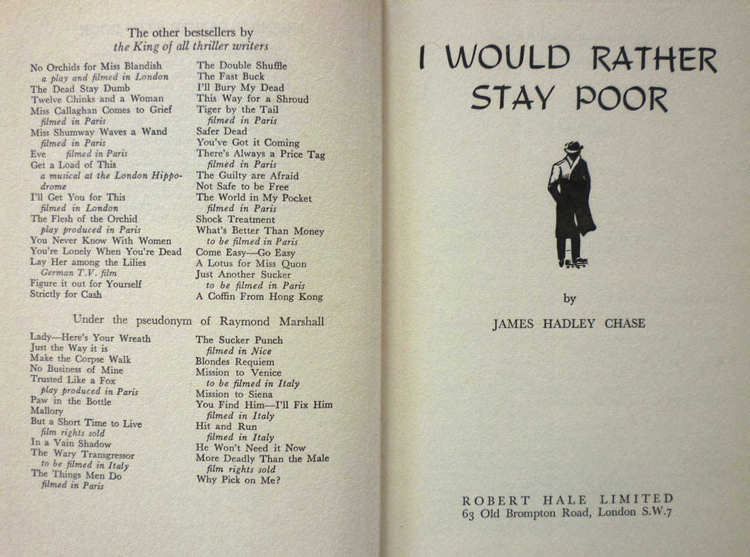
The UK first edition hardback of I Would Rather Stay Poor by James Hadley Chase, published by Robert Hale in 1962. Now, taken merely as a book, this is a fairly unremarkable item. It's one of umpteen crime thrillers that Chase – real name Rene Brabazon Raymond – wrote; witness the list of prior books opposite the title page:


Or indeed the comprehensive bibliography on this online tribute. It's a well-regarded but not especially notable entry in Chase's oeuvre, and it's not especially scarce in first edition either – at present AbeBooks has twenty copies listed. Mine came from Stort Books in Essex – whose blog can be found here – who kindly delivered the book in record time because they knew I was eager to blog about it. And the reason I was so eager to blog about it is because the dustjacket was, of course, designed by Val Biro – and I'd very recently come into possession of not one but two pieces of artwork related to that jacket.

Val, you see, is represented by children's book dealer David Schutte – Val having written and illustrated many kids' titles, notably the Gumdrop picture books – and was David's guest at the Midhurst Book, Postcard & Ephemera Fair in West Sussex earlier this month. Since I live not too far away in Lewes in East Sussex, I popped across to the Midhurst event – which, unlike many British book fairs, seems to be thriving, and had expanded into another two rooms since last I was there – and had a brief chat with Val. He kindly signed the jacket of one of the books from my collection (which he'd actually forgotten he'd designed; more on that in a future post) and I had a leaf through some of Val's jacket roughs – the quickly painted versions of book jackets that Val would show to publishers for approval before painting the final version. Most of these were for books by authors I was unfamiliar with, but David told me that he did have a handful of crime novel jacket roughs, and promised to bring what he had along to the following weekend's Lewes Book Fair.

You can probably guess where this is going, can't you? Yes, in amongst the selection of roughs David showed me at the Lewes Book Fair were a few James Hadley Chase jackets – and the best of the bunch, to my mind, were these:


As you can see, Val actually worked up a pair of roughs for I Would Rather Stay Poor. One is obviously quite close to the finished dustjacket, but the other one is interesting too – partly because it shows Val's thought processes when creating the cover, but also because two elements of this alternate version did make it onto the final jacket. If we take a look at the full printed jacket, including the spine:


We can see that instead of the figure of the man on the original rough's spine, Val has swapped in the bottle and the bundles of cash from the front of the alternate version.

For me, the 1950s and '60s were the high watermark of British book cover design, as illustrators like Peter Probyn, John Rowland, Donald Green, John Dugan, Roy Sanford, Denis McLoughlin, Patrick Gierth and of course Val Biro brought their considerable, hard-earned artistic skill and craftsmanship to bear on a succession of striking, vibrant, and most of all memorable dustjackets. Val's two roughs for I Would Rather Stay Poor afford a tantalising glimpse of the creative process behind a cover, of the choices these artists made and the techniques they deployed: chiaroscuro, restricted palettes, dynamic hand-cut lettering. Titles and author names weren't pasted on after the illustration was created, as they are today; they were painstakingly painted as part of the whole piece, intrinsic to the overall design. Certainly in Val's case – and this was a surprise to me – jacket artwork was worked up at the same size as the finished jacket, not done at a larger size and then scaled down. And on one of Val's roughs, we can even see the notes he made for the gouache pigments he intended to use:


Val painted hundreds upon hundreds of dustjackets over the years, for books by authors as varied as C. S. Forester (a number of the Hornblower novels, plus, in their Michael Joseph editions, Randall and the River of Time, 1951; Plain Murder, 1952; and The African Queen, 1953), J. B. Priestley (The Magicians, Heinemann, 1954), Evelyn Waugh (the Chapman & Hall editions of Men at Arms, 1952; Officers and Gentlemen, 1955; and The Ordeal of Gilbert Penfold, 1957) and Victor Canning (the Hodder & Stoughton editions of The Dragon Tree, 1958; The Burning Eye, 1960; A Delivery of Furies, 1961; and Black Flamingo, 1962). My two James Hadley Chase roughs were produced for a book which is, by comparison, a minor literary work, but even so: I like them a lot, and for the insight they provide into how dustjackets were created fifty years ago, they are, in a sense, invaluable.


I'll have much more from Val Biro down the line, but next on Existential Ennui, I was planning on revealing the winners of my Ilex Gift giveaway... but I think I'll be squeezing in a bonus missive ahead of that, in which, inspired by this post, I'll be unveiling a brand new permanent feature on EE...