Wednesday, 4 April 2012
New Additions to Beautiful British Book Jacket Design of the 1950s and 1960s
Well I must say the response to my new Existential Ennui permanent page, Beautiful British Book Jacket Design of the 1950s and 1960s, has been fair overwhelming. The link I tweeted to the gallery last week was retweeted to buggery – thank you to everyone who took the trouble to RT, especially Alexis Petridis (of The Guardian) and Margaret Atwood (yes, that Margaret Atwood) – with the net result that the page has received well over a thousand hits (er, make that 1,500... no, wait: 2,000... oh I give up) already. But it is, as I mentioned, an ongoing project, and so I'm pleased to announce nine new additions – some of them dustjackets by designers who are already part of the gallery – witness the Donald Green cover above – others by designers who heretofore haven't been, and still others that are brand new to Existential Ennui – bringing the total number of jackets currently on display up to thirty.
The above cover for C. S. Forester's The General may indicate that there are also a number of non-genre jackets in this batch, but that shouldn't, however, be taken as evidence that I've run out of crime or spy fiction wrappers to introduce to the gallery: I'm still mulling further additions from my collection, plus there are a number of books I'm keeping in reserve until I find the time to blog about them properly. (There are some nice surprises in store for regular readers, and I'd rather not spoil them.) There are also a handful of jackets which I've re-photographed from their original appearances on Existential Ennui (these are the lengths I go to for you, dear reader; I hope you're grateful). See if you can spot the new additions.
Coming up next here on the main blog I'll have a Violent World of Parker cross-post: a review of an early Donald E. Westlake novel, the dustjacket of which features in the Beautiful British Book Jacket Design of the 1950s and 1960s gallery...
Tuesday, 3 April 2012
Exclusive First Look at New Titan Books Covers for Three Helen MacInnes Novels: Above Suspicion, Assignment in Brittany and Pray for a Brave Heart
Here's a little Existential Ennui exclusive for you, concerning a spy fiction author who I revealed in January would be returning to print this year: "Queen of Spy Writers", Helen MacInnes. Titan Books, who'll be reissuing MacInnes's backlist beginning in June, have sent me the covers for the initial three MacInnes novels they'll be republishing: Assignment in Brittany (pub date 12 Jun; first published 1942), Pray for a Brave Heart (pub date 12 June; first published 1955) and MacInnes's debut novel, Above Suspicion (pub date 12 July; first published 1941). (Those are all UK pub dates, by the way; the books will be arriving January and March 2013 in the States.)
I'm told the quotes may change for the final versions, but other than that, these are the covers you'll be seeing on the web and in bookshops before too long. They were designed by one of Titan's in-house designers, Julia Lloyd, and they are, to my mind, suitably and pleasingly gritty. Incidentally, while there aren't too many decent reviews of Helen MacInnes's novels available online at present – although I'm sure that'll change once Titan's reissues hit – I did stumble across this thoughtful review of Above Suspicion on the In Which I Read Vintage Novels blog. I also found a couple of interesting overviews of MacInnes's life and career – one at the A Woman Reading blog, the other at the Helensburgh Heritage Trust website.
Anyway: onwards. And for my next post, I'll be staying with the attractive book cover design, as I unveil some new additions to my Beautiful British Book Jacket Design of the 1950s and 1960s page...
I'm told the quotes may change for the final versions, but other than that, these are the covers you'll be seeing on the web and in bookshops before too long. They were designed by one of Titan's in-house designers, Julia Lloyd, and they are, to my mind, suitably and pleasingly gritty. Incidentally, while there aren't too many decent reviews of Helen MacInnes's novels available online at present – although I'm sure that'll change once Titan's reissues hit – I did stumble across this thoughtful review of Above Suspicion on the In Which I Read Vintage Novels blog. I also found a couple of interesting overviews of MacInnes's life and career – one at the A Woman Reading blog, the other at the Helensburgh Heritage Trust website.
Anyway: onwards. And for my next post, I'll be staying with the attractive book cover design, as I unveil some new additions to my Beautiful British Book Jacket Design of the 1950s and 1960s page...
Monday, 2 April 2012
Felt: a Photographic History of the Band (First Third Books, 2012)
Let's begin the working week with some meandering musings on music.
It's probably true to say that the bands who've meant the most to me over the years have been the more obscure ones. Oh there are very well known bands that I've fallen for too: The Smiths, The Stone Roses, Crowded House; a few others. But it's the "lesser" lights that I've loved the most – bands that rarely, if ever, troubled the Top 40; bands whose gigs attracted crowds numbering in the hundreds rather than the thousands; bands who nevertheless commanded devoted followings who would buy every single seven inch and twelve inch and album (this is pre-the download era, you understand, when formats such as "seven inch" and "twelve inch" and even "albums" were still prevalent), without question, seeing merit in even the duffest of tracks and most incidental of B-sides. Bands like McCarthy, Kitchens of Distinction... and Felt.
Felt, if you've never heard of them – and it's a fairly safe bet that you haven't – were an English guitar band active throughout the 1980s. Ostensibly they were what's usually referred to as an "indie" band, but that only goes partway towards describing their music. Sure, most of their records – ten LPs (not counting compilations) and a dozen or so singles – were of a jangly guitar nature, but they also released an album comprised of instrumental tracks in varied styles (Let the Snakes Crinkle Their Heads to Death, Creation Records, 1986); an album with two extended keyboard instrumentals on the B-side (The Pictorial Jackson Review, Creation, 1988; the A-side consisted of short guitar pop songs recorded on 8-track); and a cocktail jazz album (Train Above the City, Creation, 1988).
So they were an unusually experimental and ambitious (musically, anyway) band – much of that ambition coming from founder, songwriter and lead vocalist Lawrence (Hayward, although his surname is rarely used). But that wasn't why I loved them (well, not entirely): I loved them for their very British take on the pop song; for the way those songs – "Penelope Tree", "Primitive Painters" and their defining (to my mind) moment, "Ballad of the Band" – frequently boasted passages of soaring beauty – delicately picked, dazzlingly lovely melodies and cascading guitar and keyboard lines; for Lawrence's quivering, half-sung, half-spoken vocals and poetic, often brutally honest lyrics; and for their carefully, artfully constructed air of mystique.
All of which is why my curiosity was piqued when I heard about this:
Felt, published by First Third Books in a limited, numbered, A4-size cloth-bound hardback edition of 1,000, all signed by Lawrence.
It's a handsomely produced collection of photographs of the band – some promotional, some personal – presented in roughly chronological order, with commentary by Lawrence. The photos are splendid enough taken on their own, but Lawrence's deadpan captions lend the enterprise a sublime absurdity, as he details his efforts to keep order in the ranks (despairing at the alcohol-fuelled antics of certain band-members; enforcing a "no smiling" policy during photo shoots and ensuring there were no double-chins in pictures by shouting "d-c, d-c!" before the shutter clicked) and retain absolute control over how Felt were perceived (not always successfully, it must be said).
Occasionally these endeavours verge on the hysterical: Lawrence eulogises the band's "neat, groomed, yet still tough" look in one set of fey pictures, and when asked to participate in a book about Creation Records is astounded by the lack of interest by other artists in the "crucial decision" of which photos should appear in the book, leading to, for them, "dire visual representation". But mostly his captions demonstrate an admirable (and largely thankless) commitment to Felt as a concept and an ideal – a commitment which helps to explain why the band were so special, and why they're still held in such high regard by fans of a certain age. Although, as ever with music, it's often simpler to let the songs speak for themselves:
Felt is still available from First Third, priced £39 plus p&p, although if you'd like to get hold of a copy, I'd advise you to get your skates on: my one is number 637, which means there are probably only a couple of hundred left now. Better yet, if you're unfamiliar with Felt and are intrigued by the YouTube clips above, Cherry Red Records have most of their albums available on CD.
Addendum: Felt – which is to say Lawrence – had a knack for coming up with evocative song titles, but it occurs to me that one in particular has come to embody my exploration of twentieth century authors over the past few years...
It's probably true to say that the bands who've meant the most to me over the years have been the more obscure ones. Oh there are very well known bands that I've fallen for too: The Smiths, The Stone Roses, Crowded House; a few others. But it's the "lesser" lights that I've loved the most – bands that rarely, if ever, troubled the Top 40; bands whose gigs attracted crowds numbering in the hundreds rather than the thousands; bands who nevertheless commanded devoted followings who would buy every single seven inch and twelve inch and album (this is pre-the download era, you understand, when formats such as "seven inch" and "twelve inch" and even "albums" were still prevalent), without question, seeing merit in even the duffest of tracks and most incidental of B-sides. Bands like McCarthy, Kitchens of Distinction... and Felt.
Felt, if you've never heard of them – and it's a fairly safe bet that you haven't – were an English guitar band active throughout the 1980s. Ostensibly they were what's usually referred to as an "indie" band, but that only goes partway towards describing their music. Sure, most of their records – ten LPs (not counting compilations) and a dozen or so singles – were of a jangly guitar nature, but they also released an album comprised of instrumental tracks in varied styles (Let the Snakes Crinkle Their Heads to Death, Creation Records, 1986); an album with two extended keyboard instrumentals on the B-side (The Pictorial Jackson Review, Creation, 1988; the A-side consisted of short guitar pop songs recorded on 8-track); and a cocktail jazz album (Train Above the City, Creation, 1988).
So they were an unusually experimental and ambitious (musically, anyway) band – much of that ambition coming from founder, songwriter and lead vocalist Lawrence (Hayward, although his surname is rarely used). But that wasn't why I loved them (well, not entirely): I loved them for their very British take on the pop song; for the way those songs – "Penelope Tree", "Primitive Painters" and their defining (to my mind) moment, "Ballad of the Band" – frequently boasted passages of soaring beauty – delicately picked, dazzlingly lovely melodies and cascading guitar and keyboard lines; for Lawrence's quivering, half-sung, half-spoken vocals and poetic, often brutally honest lyrics; and for their carefully, artfully constructed air of mystique.
All of which is why my curiosity was piqued when I heard about this:
Felt, published by First Third Books in a limited, numbered, A4-size cloth-bound hardback edition of 1,000, all signed by Lawrence.
It's a handsomely produced collection of photographs of the band – some promotional, some personal – presented in roughly chronological order, with commentary by Lawrence. The photos are splendid enough taken on their own, but Lawrence's deadpan captions lend the enterprise a sublime absurdity, as he details his efforts to keep order in the ranks (despairing at the alcohol-fuelled antics of certain band-members; enforcing a "no smiling" policy during photo shoots and ensuring there were no double-chins in pictures by shouting "d-c, d-c!" before the shutter clicked) and retain absolute control over how Felt were perceived (not always successfully, it must be said).
Occasionally these endeavours verge on the hysterical: Lawrence eulogises the band's "neat, groomed, yet still tough" look in one set of fey pictures, and when asked to participate in a book about Creation Records is astounded by the lack of interest by other artists in the "crucial decision" of which photos should appear in the book, leading to, for them, "dire visual representation". But mostly his captions demonstrate an admirable (and largely thankless) commitment to Felt as a concept and an ideal – a commitment which helps to explain why the band were so special, and why they're still held in such high regard by fans of a certain age. Although, as ever with music, it's often simpler to let the songs speak for themselves:
Felt is still available from First Third, priced £39 plus p&p, although if you'd like to get hold of a copy, I'd advise you to get your skates on: my one is number 637, which means there are probably only a couple of hundred left now. Better yet, if you're unfamiliar with Felt and are intrigued by the YouTube clips above, Cherry Red Records have most of their albums available on CD.
Addendum: Felt – which is to say Lawrence – had a knack for coming up with evocative song titles, but it occurs to me that one in particular has come to embody my exploration of twentieth century authors over the past few years...
Friday, 30 March 2012
The Ilex Gift Giveaway: The Three Winners!
As is now traditional with my competitions (well, I've done it once before, anyway): drum roll, please! It's time to unveil the winners of my magnificent Ilex Gift giveaway!
To recap: two weeks ago I gave you all, you lucky Existential Ennui readers, you, the chance to win an, if I do say so myself, impressive amount of swag, courtesy of Lewes-based publisher Ilex Press and their new imprint, Ilex Gift. The haul comprised:
6 x Little Books:
• Little Book of Vintage Romance
• Little Book of Vintage Sci-Fi
• Little Book of Vintage Combat
• Little Book of Vintage Crime
• Little Book of Vintage Sauciness
• Little Book of Vintage Horror
2 x Journals:
• Lovelorn Journal
• Tales of Terror Journal
2 x Postcard Books:
• Lovelorn: 30 Postcards
• Tales of Terror: 30 Postcards
1 x Magnet Pack
• Lovelorn: 16 Classic Romance Comic Magnets
each, for three Existential Ennui readers. Well with the competition now closed, and the entries all deposited in a fetching chapeau, I can now reveal which three winners were drawn from that hat. They are:
Dan Lester, Leeds, UK
Mark Bennett, Brighton, UK
Karl A. Russell, Widnes, UK
Well done to all three of you! Your prizes will be winging their way to you shortly. Thank you to everyone who took part – there were quite a lot of you – and don't despair if you didn't win: the Ilex Gift range will be available in all good bookshops soon!
Thursday, 29 March 2012
Beautiful British Book Jacket Design of the 1950s and 1960s: A Permanent Page
As regular readers (usual caveats vis-a-vis "regular" – and indeed "readers" – apply) of Existential Ennui will know, I'm forever banging on about dustjacket design, in particular the jackets which wrapped around British books in the 1950s and '60s, especially – and unsurprisingly, given the loose remit of this blog – those gracing the thrillers and genre works of the era. To my mind, this period was something of a golden age for wrapper artwork, and you can find lots of examples of dustjackets from that mid-20th century era littering Existential Ennui.
And therein lies the problem: those covers are scattered about this blog like so much flotsam (or jetsam), and not readily accessible unless you're prepared to endlessly scroll through Existential Ennui – which, for various reasons (although chiefly to do with potential boredom), I wouldn't recommend. Yesterday, however, whilst tweeting links to past posts showing examples of great British dustjackets (an act of temporary insanity which was in turn inspired by this post on Val Biro), I had a brainwave: why not create a dedicated page for the best examples of British jacket design from the '50s and '60s, drawing on books from my collection?
Why not indeed. And so that's precisely what I've done. You can find the dedicated page here, or by clicking on the permanent "Pages of Particular Interest" link at the top of Existential Ennui's right-hand sidebar. Inside you'll find a cornucopia of covers, some you'll have seen before, others perhaps not – and a couple, one by Val Biro (the stunning jacket for Victor Canning's A Delivery of Furies which you can see above), the other by Peter Probyn (an elegant one for Francis Clifford's The Hunting-Ground), I'm presenting for the first time on Existential Ennui – arranged alphabetically by designer, with links to whatever nonsense I've written about that particular book or cover artist (if anything). It's a work in progress – I'll be adding to it as I find new examples – but it's off to a good start, I feel, and should hopefully prove a valuable resource as time goes by (not least to me). So go have a look and let me know what you think. And hey, you never know: I may even, at some stage, get round to doing a paperback cover page as well...
Wednesday, 28 March 2012
Anatomy of a Cover: I Would Rather Stay Poor by James Hadley Chase (Robert Hale, 1962); Val Biro Jacket Art and Roughs
As teased in yesterday's final Geoffrey Household post, today's post concerns the artist responsible for the dustjacket on that 1952 Michael Joseph edition of A Time to Kill – one Val Biro. I've mentioned Biro's work once or twice before, but recently I've been paying more attention to the books his artwork graces the jackets of, especially those which fall within the broad remit of Existential Ennui – crime fiction, spy fiction and so forth. Reason being, I had the great pleasure of meeting Mr. Biro just the other week, and consequently acquired two pieces of ephemera related to this book:
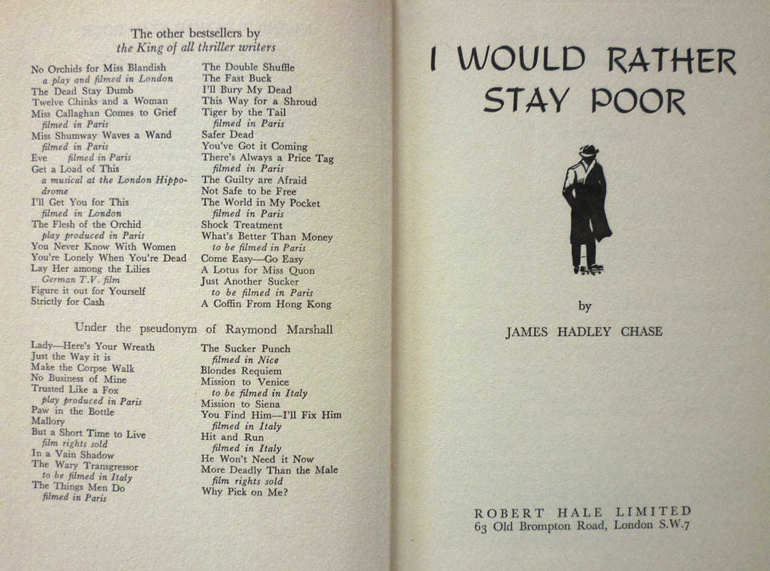
The UK first edition hardback of I Would Rather Stay Poor by James Hadley Chase, published by Robert Hale in 1962. Now, taken merely as a book, this is a fairly unremarkable item. It's one of umpteen crime thrillers that Chase – real name Rene Brabazon Raymond – wrote; witness the list of prior books opposite the title page:
Or indeed the comprehensive bibliography on this online tribute. It's a well-regarded but not especially notable entry in Chase's oeuvre, and it's not especially scarce in first edition either – at present AbeBooks has twenty copies listed. Mine came from Stort Books in Essex – whose blog can be found here – who kindly delivered the book in record time because they knew I was eager to blog about it. And the reason I was so eager to blog about it is because the dustjacket was, of course, designed by Val Biro – and I'd very recently come into possession of not one but two pieces of artwork related to that jacket.
Val, you see, is represented by children's book dealer David Schutte – Val having written and illustrated many kids' titles, notably the Gumdrop picture books – and was David's guest at the Midhurst Book, Postcard & Ephemera Fair in West Sussex earlier this month. Since I live not too far away in Lewes in East Sussex, I popped across to the Midhurst event – which, unlike many British book fairs, seems to be thriving, and had expanded into another two rooms since last I was there – and had a brief chat with Val. He kindly signed the jacket of one of the books from my collection (which he'd actually forgotten he'd designed; more on that in a future post) and I had a leaf through some of Val's jacket roughs – the quickly painted versions of book jackets that Val would show to publishers for approval before painting the final version. Most of these were for books by authors I was unfamiliar with, but David told me that he did have a handful of crime novel jacket roughs, and promised to bring what he had along to the following weekend's Lewes Book Fair.
You can probably guess where this is going, can't you? Yes, in amongst the selection of roughs David showed me at the Lewes Book Fair were a few James Hadley Chase jackets – and the best of the bunch, to my mind, were these:
As you can see, Val actually worked up a pair of roughs for I Would Rather Stay Poor. One is obviously quite close to the finished dustjacket, but the other one is interesting too – partly because it shows Val's thought processes when creating the cover, but also because two elements of this alternate version did make it onto the final jacket. If we take a look at the full printed jacket, including the spine:
We can see that instead of the figure of the man on the original rough's spine, Val has swapped in the bottle and the bundles of cash from the front of the alternate version.
For me, the 1950s and '60s were the high watermark of British book cover design, as illustrators like Peter Probyn, John Rowland, Donald Green, John Dugan, Roy Sanford, Denis McLoughlin, Patrick Gierth and of course Val Biro brought their considerable, hard-earned artistic skill and craftsmanship to bear on a succession of striking, vibrant, and most of all memorable dustjackets. Val's two roughs for I Would Rather Stay Poor afford a tantalising glimpse of the creative process behind a cover, of the choices these artists made and the techniques they deployed: chiaroscuro, restricted palettes, dynamic hand-cut lettering. Titles and author names weren't pasted on after the illustration was created, as they are today; they were painstakingly painted as part of the whole piece, intrinsic to the overall design. Certainly in Val's case – and this was a surprise to me – jacket artwork was worked up at the same size as the finished jacket, not done at a larger size and then scaled down. And on one of Val's roughs, we can even see the notes he made for the gouache pigments he intended to use:
Val painted hundreds upon hundreds of dustjackets over the years, for books by authors as varied as C. S. Forester (a number of the Hornblower novels, plus, in their Michael Joseph editions, Randall and the River of Time, 1951; Plain Murder, 1952; and The African Queen, 1953), J. B. Priestley (The Magicians, Heinemann, 1954), Evelyn Waugh (the Chapman & Hall editions of Men at Arms, 1952; Officers and Gentlemen, 1955; and The Ordeal of Gilbert Penfold, 1957) and Victor Canning (the Hodder & Stoughton editions of The Dragon Tree, 1958; The Burning Eye, 1960; A Delivery of Furies, 1961; and Black Flamingo, 1962). My two James Hadley Chase roughs were produced for a book which is, by comparison, a minor literary work, but even so: I like them a lot, and for the insight they provide into how dustjackets were created fifty years ago, they are, in a sense, invaluable.
I'll have much more from Val Biro down the line, but next on Existential Ennui, I was planning on revealing the winners of my Ilex Gift giveaway... but I think I'll be squeezing in a bonus missive ahead of that, in which, inspired by this post, I'll be unveiling a brand new permanent feature on EE...
The UK first edition hardback of I Would Rather Stay Poor by James Hadley Chase, published by Robert Hale in 1962. Now, taken merely as a book, this is a fairly unremarkable item. It's one of umpteen crime thrillers that Chase – real name Rene Brabazon Raymond – wrote; witness the list of prior books opposite the title page:
Or indeed the comprehensive bibliography on this online tribute. It's a well-regarded but not especially notable entry in Chase's oeuvre, and it's not especially scarce in first edition either – at present AbeBooks has twenty copies listed. Mine came from Stort Books in Essex – whose blog can be found here – who kindly delivered the book in record time because they knew I was eager to blog about it. And the reason I was so eager to blog about it is because the dustjacket was, of course, designed by Val Biro – and I'd very recently come into possession of not one but two pieces of artwork related to that jacket.
Val, you see, is represented by children's book dealer David Schutte – Val having written and illustrated many kids' titles, notably the Gumdrop picture books – and was David's guest at the Midhurst Book, Postcard & Ephemera Fair in West Sussex earlier this month. Since I live not too far away in Lewes in East Sussex, I popped across to the Midhurst event – which, unlike many British book fairs, seems to be thriving, and had expanded into another two rooms since last I was there – and had a brief chat with Val. He kindly signed the jacket of one of the books from my collection (which he'd actually forgotten he'd designed; more on that in a future post) and I had a leaf through some of Val's jacket roughs – the quickly painted versions of book jackets that Val would show to publishers for approval before painting the final version. Most of these were for books by authors I was unfamiliar with, but David told me that he did have a handful of crime novel jacket roughs, and promised to bring what he had along to the following weekend's Lewes Book Fair.
You can probably guess where this is going, can't you? Yes, in amongst the selection of roughs David showed me at the Lewes Book Fair were a few James Hadley Chase jackets – and the best of the bunch, to my mind, were these:
As you can see, Val actually worked up a pair of roughs for I Would Rather Stay Poor. One is obviously quite close to the finished dustjacket, but the other one is interesting too – partly because it shows Val's thought processes when creating the cover, but also because two elements of this alternate version did make it onto the final jacket. If we take a look at the full printed jacket, including the spine:
We can see that instead of the figure of the man on the original rough's spine, Val has swapped in the bottle and the bundles of cash from the front of the alternate version.
For me, the 1950s and '60s were the high watermark of British book cover design, as illustrators like Peter Probyn, John Rowland, Donald Green, John Dugan, Roy Sanford, Denis McLoughlin, Patrick Gierth and of course Val Biro brought their considerable, hard-earned artistic skill and craftsmanship to bear on a succession of striking, vibrant, and most of all memorable dustjackets. Val's two roughs for I Would Rather Stay Poor afford a tantalising glimpse of the creative process behind a cover, of the choices these artists made and the techniques they deployed: chiaroscuro, restricted palettes, dynamic hand-cut lettering. Titles and author names weren't pasted on after the illustration was created, as they are today; they were painstakingly painted as part of the whole piece, intrinsic to the overall design. Certainly in Val's case – and this was a surprise to me – jacket artwork was worked up at the same size as the finished jacket, not done at a larger size and then scaled down. And on one of Val's roughs, we can even see the notes he made for the gouache pigments he intended to use:
Val painted hundreds upon hundreds of dustjackets over the years, for books by authors as varied as C. S. Forester (a number of the Hornblower novels, plus, in their Michael Joseph editions, Randall and the River of Time, 1951; Plain Murder, 1952; and The African Queen, 1953), J. B. Priestley (The Magicians, Heinemann, 1954), Evelyn Waugh (the Chapman & Hall editions of Men at Arms, 1952; Officers and Gentlemen, 1955; and The Ordeal of Gilbert Penfold, 1957) and Victor Canning (the Hodder & Stoughton editions of The Dragon Tree, 1958; The Burning Eye, 1960; A Delivery of Furies, 1961; and Black Flamingo, 1962). My two James Hadley Chase roughs were produced for a book which is, by comparison, a minor literary work, but even so: I like them a lot, and for the insight they provide into how dustjackets were created fifty years ago, they are, in a sense, invaluable.
I'll have much more from Val Biro down the line, but next on Existential Ennui, I was planning on revealing the winners of my Ilex Gift giveaway... but I think I'll be squeezing in a bonus missive ahead of that, in which, inspired by this post, I'll be unveiling a brand new permanent feature on EE...
Subscribe to:
Posts (Atom)